

There are plenty of good libraries for charting data in Python, perhaps too many. Plotly is great, but a limit of 25 free charts is hardly a starting point. Sure, there's Matplotlib, but surely we find something a little less... well, lame. Where are all the simple-yet-powerful chart libraries at?
As you’ve probably guessed, this is where Seaborn comes in. Seaborn isn’t a third-party library, so you can get started without creating user accounts or worrying about API limits, etc. Seaborn is also built on top of Matplotlib, making it the logical next step up for anybody wanting some firepower from their charts.
We’ll explore Seaborn by charting some data ourselves. We'll walk through the process of preparing data for charting, plotting said charts, and exploring the available functionality along the way. This tutorials assumes you have a working knowledge of Pandas, and access to a Jupyter notebook interface.
Preparing Data in Pandas
First thing's first, we're going to need some data. To keep our focus on charting as opposed to complicated data cleaning, I'm going to use the most straightforward kind data set known to mankind: weather. As an added bonus, this will allows us to celebrate our inevitable impending doom as the world warms over 3 degrees Celsius on average in the years to come. The data set we'll be using is Kaggle's Historial Hourly Weather Data.
With these CSVs saved locally, we can get started inspecting our data:
import pandas as pd
import seaborn as sns
from matplotlib import pyplot


temperature_df = pd.read_csv('temperature.csv')

print(temperature_df.head(5))
print(temperature_df.tail(5))This gives us the following output:
| datetime | Vancouver | Portland | San Francisco | Seattle | Los Angeles | San Diego | Las Vegas | Phoenix | Albuquerque | Denver | San Antonio | Dallas | Houston | Kansas City | Minneapolis | Saint Louis | Chicago | Nashville | Indianapolis | Atlanta | Detroit | Jacksonville | Charlotte | Miami | Pittsburgh | Toronto | Philadelphia | New York | Montreal | Boston | Beersheba | Tel Aviv District | Eilat | Haifa | Nahariyya | Jerusalem |
|---|---|---|---|---|---|---|---|---|---|---|---|---|---|---|---|---|---|---|---|---|---|---|---|---|---|---|---|---|---|---|---|---|---|---|---|---|
| 2012-10-01 12:00:00 | 309.1 | |||||||||||||||||||||||||||||||||||
| 2012-10-01 13:00:00 | 284.63 | 282.08 | 289.48 | 281.8 | 291.87 | 291.53 | 293.41 | 296.6 | 285.12 | 284.61 | 289.29 | 289.74 | 288.27 | 289.98 | 286.87 | 286.18 | 284.01 | 287.41 | 283.85 | 294.03 | 284.03 | 298.17 | 288.65 | 299.72 | 281 | 286.26 | 285.63 | 288.22 | 285.83 | 287.17 | 307.59 | 305.47 | 310.58 | 304.4 | 304.4 | 303.5 |
| 2012-10-01 14:00:00 | 284.629 | 282.083 | 289.475 | 281.797 | 291.868 | 291.534 | 293.403 | 296.609 | 285.155 | 284.607 | 289.304 | 289.763 | 288.298 | 289.998 | 286.894 | 286.185 | 284.055 | 287.421 | 283.889 | 294.035 | 284.07 | 298.205 | 288.65 | 299.733 | 281.025 | 286.263 | 285.663 | 288.248 | 285.835 | 287.186 | 307.59 | 304.31 | 310.496 | 304.4 | 304.4 | 303.5 |
| 2012-10-01 15:00:00 | 284.627 | 282.092 | 289.461 | 281.79 | 291.863 | 291.543 | 293.392 | 296.632 | 285.234 | 284.6 | 289.339 | 289.831 | 288.334 | 290.038 | 286.951 | 286.199 | 284.177 | 287.455 | 283.942 | 294.05 | 284.174 | 298.3 | 288.651 | 299.767 | 281.088 | 286.27 | 285.757 | 288.327 | 285.848 | 287.232 | 307.392 | 304.282 | 310.412 | 304.4 | 304.4 | 303.5 |
| 2012-10-01 16:00:00 | 284.625 | 282.1 | 289.446 | 281.782 | 291.858 | 291.553 | 293.381 | 296.654 | 285.313 | 284.593 | 289.373 | 289.899 | 288.371 | 290.079 | 287.009 | 286.213 | 284.3 | 287.488 | 283.994 | 294.064 | 284.278 | 298.394 | 288.651 | 299.801 | 281.152 | 286.276 | 285.85 | 288.406 | 285.861 | 287.277 | 307.145 | 304.238 | 310.327 | 304.4 | 304.4 | 303.5 |
| 2017-11-29 20:00:00 | 282 | 280.82 | 293.55 | 292.15 | 289.54 | 294.71 | 285.72 | 289.56 | 294.7 | 290.48 | 295.15 | 285.33 | 279.79 | 285.41 | 281.34 | 292.89 | 285.98 | 290.04 | 281.25 | 296.92 | 294.15 | 285.3 | 278.74 | 290.24 | 275.13 | 288.08 | ||||||||||
| 2017-11-29 21:00:00 | 282.89 | 281.65 | 295.68 | 292.74 | 290.61 | 295.59 | 286.45 | 290.7 | 295.82 | 291.02 | 295.82 | 285.16 | 280.22 | 286.01 | 281.69 | 292.4 | 286.17 | 291.42 | 281.05 | 296.92 | 293.9 | 285.33 | 278.75 | 289.24 | 274.13 | 286.02 | ||||||||||
| 2017-11-29 22:00:00 | 283.39 | 282.75 | 295.96 | 292.58 | 291.34 | 296.25 | 286.44 | 289.71 | 296.04 | 291.15 | 296.37 | 285.16 | 279.92 | 286.04 | 281.07 | 291.65 | 284.21 | 291.84 | 280.17 | 296.33 | 292.06 | 282.91 | 277.55 | 286.78 | 273.48 | 283.94 | ||||||||||
| 2017-11-29 23:00:00 | 283.02 | 282.96 | 295.65 | 292.61 | 292.15 | 297.15 | 286.14 | 289.17 | 295.28 | 289.59 | 294.65 | 285.36 | 279.07 | 285.03 | 280.06 | 287.64 | 283.2 | 290.64 | 278.06 | 294.95 | 287.58 | 280.14 | 276.16 | 284.57 | 272.48 | 282.17 | ||||||||||
| 2017-11-30 00:00:00 | 282.28 | 283.04 | 294.93 | 291.4 | 291.64 | 297.15 | 284.7 | 285.18 | 292.02 | 287.88 | 291.44 | 285.15 | 278.08 | 283.44 | 278.46 | 285.9 | 282.78 | 287.74 | 276.59 | 293.15 | 285.61 | 279.19 | 274.51 | 283.42 | 271.8 | 280.65 |
This tells us a few things:
- The extent of this data set begins on October 1st, 2012 and ends on on November 29th, 2017.
- Not all cities have sufficient data which begins and ends on these dates.
- Data has been taken at 1-hour intervals, 24 times per day.
- Temperatures are in Kelvin: the world's most useless unit of measurement.
Remove Extraneous Data
24 readings per day is a lot. Creating charts can take a significant amount of system resources (and time), which makes 24 separate temperatures every day ludicrous. Let's save ourselves 23/24ths of this headache by taking our recorded temperatures down to one reading per day.
We'll modify our DataFrame to only include one out of every 24 rows:
modified_df = temperature_df.iloc[::24]Take A Sample Size
We'll only want to chart the values for one location to start, so let's start with New York.
It could also be interesting to map this data year-over-year to observe any changes. To do this, we'll reduce our data set to only include the first year of readings.
Lastly, we'll want to remove those empty cells we noticed from this incomplete data set. All the above gives us the following:
import pandas as pd
import seaborn as sns
from matplotlib import pyplot as plt


temperature_df = pd.read_csv('temperature.csv')
nyc_df = temperature_df[['datetime','New York']]
nyc_df = nyc_df.iloc[::24]
nyc_df.dropna(how='any', inplace=True)

print(nyc_df.head(5))
print(nyc_df.tail(5))The resulting snippet gives us one recorded temperature per day in the first year of results. The output should look like this:
| date | New York | |
|---|---|---|
| 24 | 2012-10-02 | 289.99 |
| 48 | 2012-10-03 | 290.37 |
| 72 | 2012-10-04 | 290.84 |
| 96 | 2012-10-05 | 293.18 |
| 120 | 2012-10-06 | 288.24 |
| 8640 | 2013-09-26 | 286.22 |
| 8664 | 2013-09-27 | 285.37 |
| 8688 | 2013-09-28 | 286.65 |
| 8712 | 2013-09-29 | 286.290 |
| 8736 | 2013-09-30 | 283.435 |
Fixing Our Temperatures
We've got to do something about this Kelvin situation. The last time I measured anything in degrees Kelvin was while monitoring my reactor heat in Mech Warrior 2. Don't try and find that game, it's a relic from the 90's.
A quick Google search reveals the formula for converting Kelvin to Fahrenheit:
(x − 273.15) × 9/5 + 32This calls for a lambda function!
nyc_df['temp'] = nyc_df['temp'].apply(lambda x: (x-273.15) * 9/5 + 32)Checking our work with print(nyc_df.head(5)):
| datetime | Vancouver | Portland | San Francisco | Seattle | Los Angeles | San Diego | Las Vegas | Phoenix | Albuquerque | Denver | San Antonio | Dallas | Houston | Kansas City | Minneapolis | Saint Louis | Chicago | Nashville | Indianapolis | Atlanta | Detroit | Jacksonville | Charlotte | Miami | Pittsburgh | Toronto | Philadelphia | New York | Montreal | Boston | Beersheba | Tel Aviv District | Eilat | Haifa | Nahariyya | Jerusalem |
|---|---|---|---|---|---|---|---|---|---|---|---|---|---|---|---|---|---|---|---|---|---|---|---|---|---|---|---|---|---|---|---|---|---|---|---|---|
| 2012-10-01 12:00:00 | 309.1 | |||||||||||||||||||||||||||||||||||
| 2012-10-01 13:00:00 | 284.63 | 282.08 | 289.48 | 281.8 | 291.87 | 291.53 | 293.41 | 296.6 | 285.12 | 284.61 | 289.29 | 289.74 | 288.27 | 289.98 | 286.87 | 286.18 | 284.01 | 287.41 | 283.85 | 294.03 | 284.03 | 298.17 | 288.65 | 299.72 | 281 | 286.26 | 285.63 | 288.22 | 285.83 | 287.17 | 307.59 | 305.47 | 310.58 | 304.4 | 304.4 | 303.5 |
| 2012-10-01 14:00:00 | 284.629 | 282.083 | 289.475 | 281.797 | 291.868 | 291.534 | 293.403 | 296.609 | 285.155 | 284.607 | 289.304 | 289.763 | 288.298 | 289.998 | 286.894 | 286.185 | 284.055 | 287.421 | 283.889 | 294.035 | 284.07 | 298.205 | 288.65 | 299.733 | 281.025 | 286.263 | 285.663 | 288.248 | 285.835 | 287.186 | 307.59 | 304.31 | 310.496 | 304.4 | 304.4 | 303.5 |
| 2012-10-01 15:00:00 | 284.627 | 282.092 | 289.461 | 281.79 | 291.863 | 291.543 | 293.392 | 296.632 | 285.234 | 284.6 | 289.339 | 289.831 | 288.334 | 290.038 | 286.951 | 286.199 | 284.177 | 287.455 | 283.942 | 294.05 | 284.174 | 298.3 | 288.651 | 299.767 | 281.088 | 286.27 | 285.757 | 288.327 | 285.848 | 287.232 | 307.392 | 304.282 | 310.412 | 304.4 | 304.4 | 303.5 |
| 2012-10-01 16:00:00 | 284.625 | 282.1 | 289.446 | 281.782 | 291.858 | 291.553 | 293.381 | 296.654 | 285.313 | 284.593 | 289.373 | 289.899 | 288.371 | 290.079 | 287.009 | 286.213 | 284.3 | 287.488 | 283.994 | 294.064 | 284.278 | 298.394 | 288.651 | 299.801 | 281.152 | 286.276 | 285.85 | 288.406 | 285.861 | 287.277 | 307.145 | 304.238 | 310.327 | 304.4 | 304.4 | 303.5 |
| 2017-11-29 20:00:00 | 282 | 280.82 | 293.55 | 292.15 | 289.54 | 294.71 | 285.72 | 289.56 | 294.7 | 290.48 | 295.15 | 285.33 | 279.79 | 285.41 | 281.34 | 292.89 | 285.98 | 290.04 | 281.25 | 296.92 | 294.15 | 285.3 | 278.74 | 290.24 | 275.13 | 288.08 | ||||||||||
| 2017-11-29 21:00:00 | 282.89 | 281.65 | 295.68 | 292.74 | 290.61 | 295.59 | 286.45 | 290.7 | 295.82 | 291.02 | 295.82 | 285.16 | 280.22 | 286.01 | 281.69 | 292.4 | 286.17 | 291.42 | 281.05 | 296.92 | 293.9 | 285.33 | 278.75 | 289.24 | 274.13 | 286.02 | ||||||||||
| 2017-11-29 22:00:00 | 283.39 | 282.75 | 295.96 | 292.58 | 291.34 | 296.25 | 286.44 | 289.71 | 296.04 | 291.15 | 296.37 | 285.16 | 279.92 | 286.04 | 281.07 | 291.65 | 284.21 | 291.84 | 280.17 | 296.33 | 292.06 | 282.91 | 277.55 | 286.78 | 273.48 | 283.94 | ||||||||||
| 2017-11-29 23:00:00 | 283.02 | 282.96 | 295.65 | 292.61 | 292.15 | 297.15 | 286.14 | 289.17 | 295.28 | 289.59 | 294.65 | 285.36 | 279.07 | 285.03 | 280.06 | 287.64 | 283.2 | 290.64 | 278.06 | 294.95 | 287.58 | 280.14 | 276.16 | 284.57 | 272.48 | 282.17 | ||||||||||
| 2017-11-30 00:00:00 | 282.28 | 283.04 | 294.93 | 291.4 | 291.64 | 297.15 | 284.7 | 285.18 | 292.02 | 287.88 | 291.44 | 285.15 | 278.08 | 283.44 | 278.46 | 285.9 | 282.78 | 287.74 | 276.59 | 293.15 | 285.61 | 279.19 | 274.51 | 283.42 | 271.8 | 280.65 |
Adjusting Our Datatypes
We loaded our data from a CSV, so we know our data types are going to be trash. Pandas notoriously stores data types from CSVs as objects when it doesn't know what's up. Quickly running print(nyc_df.info()) reveals this:
<class 'pandas.core.frame.DataFrame'>
Int64Index: 1852 entries, 24 to 44448
Data columns (total 2 columns):
date           1852 non-null object
temp           1852 non-null float64
dtypes: float64(1), object(1)
memory usage: 43.4+ KB
None"Object" is a fancy Pandas word for "uselessly broad classification of data type." Pandas sees the special characters in this column's data, thus immediately surrenders any attempt to logically parse said data. Let's fix this:
nyc_df['date'] = pd.to_datetime(nyc_df['date']).info() should now display the "date" column as being a "datetime" data type:
<class 'pandas.core.frame.DataFrame'>
Int64Index: 1852 entries, 24 to 44448
Data columns (total 2 columns):
date           1852 non-null datetime64[ns]
temp           1852 non-null float64
dtypes: datetime64[ns](1), float64(1)
memory usage:43.4 KB
Nonenyc_df.info()Seaborn-Friendly Data Formatting
Consider the chart we're about to make for a moment: we're looking to make a multi-line chart on a single plot, where we overlay temperature readings atop each other, year-over-year. Despite mapping multiple lines, Seaborn plots will only accept a DataFrame which has a single column for all X values, and a single column for all Y values. This means that despite being multiple lines, all of our lines' values will live in a single massive column. Because of this, we need to somehow group cells in this column as though to say "these values belong to line 1, those values belong to line 1".
We can accomplish this via a third column. This column serves as a "label" which will group all values of the same label together (ie: create a single line). We're creating one plot per year, so this is actually quite easy:
nyc_df['year'] = nyc_df['date'].dt.yearIt's that simple! We need to do this once more for the day of the year to represent our X values:
nyc_df['day'] = nyc_df['date'].dt.dayofyearChecking the output:
                   date      temp   year   day
0   2012-10-02 12:00:00   62.3147   2012   276
1   2012-10-03 12:00:00   62.9960   2012   277
2   2012-10-04 12:00:00   63.8420   2012   278
3   2012-10-05 12:00:00   68.0540   2012   279
4 2012-10-06 12:00:00 59.1620 2012 280Housecleaning
We just did a whole bunch, but we've made a bit of a mess in the process.
For one, we never modified our column names. Why have a column named New York in a data set which is already named as such? How would anybody know what the numbers in this column represent, exactly? Let's adjust:
nyc_df.columns = ['date','temperature']Our row indexes need to be fixed after dropping all those empty rows earlier. Let's fix this:
nyc_df.reset_index(inplace=True)Whew, that was a lot! Let's recap everything we've done so far:
import pandas as pd
import seaborn as sns
from matplotlib import pyplot as plt


# Load Data From CSV
temperature_df = pd.read_csv('temperature.csv')

# Get NYC temperatures daily
nyc_df = temperature_df[['datetime','New York']]
nyc_df = nyc_df.iloc[::24]
nyc_df.dropna(how='any', inplace=True)

# Convert temperature to Farenheight
nyc_df['New York'] = nyc_df['New York'].apply(lambda x: (x-273.15) * 9/5 + 32)

# Set X axis, group Y axis
nyc_df['date'] = pd.to_datetime(nyc_df['date'])
nyc_df['year'] = nyc_df['date'].dt.year
nyc_df['day'] = nyc_df['date'].dt.dayofyear

# Cleanup
nyc_df.columns = ['date','temperature']
nyc_df.reset_index(inplace=True)Chart Preparation
The first type of chart we'll be looking at will be a line chart, showing temperature change over time. Before mapping that data, we must first set the stage. Without setting the proper metadata for our chart, it will default to being an ugly, 5x5 square without a title.
Showing Charts Inline in Jupyter
Before we can see any charts, we need to explicitly configure our notebook to show inline charts. This is accomplished in Jupyter with a "magic function". Scroll back to the start of your notebook, and make sure %matplotlib inline is present from the beginning:
import pandas as pd
import seaborn as sns
from matplotlib import pyplot as plt
%matplotlib inlineSetting Plot Size
If you're familiar with Matplotlib, this next part should look familiar:
plt.figure(figsize=(15, 7))Indeed, we're acting on plt, which is the alias we gave pyplot (an import from the Matplotlib library). The above sets the dimensions of a chart: 15x7 inches. Because Seaborn runs on Matplotlib at its core, we can modify our chart with the same syntax as modifying Matplotlib charts.
Setting Our Chart Colors
But what about colors? Isn't the "pretty" aspect of Seaborn the whole reason we're using it? Indeed it is, friend:
sns.palplot(sns.color_palette("husl", 8))...And the output:

Wait, what did we just do? We set a new color pallet for our chart, using the built-in "husl" palette built in the Seaborn. There are plenty of other ways to control your color palette, which is poorly explained in their documentation here.
Naming Our Chart
plt.set_title('NYC Weather Over Time')We've now titled our chart NYC Weather Over Time. The two lines of code above combined result in this output:
We've now set the style of our chart, set the size dimensions, and given it a name. We're just about ready for business.
Plotting Line Charts
Now for the good stuff: creating charts! In Seaborn, a plot is created by using the sns.plottype() syntax, where plottype() is to be substituted with the type of chart we want to see. We're plotting a line chart, so we'll use sns.lineplot():
nyc_chart = sns.lineplot(
    x="day",
    y="temp",
    hue='year',
    data=nyc_df
).set_title('NYC Weather Over Time')
plt.show()Take note of our passed arguments here:
datais the Pandas DataFrame containing our chart's data.xandyare the columns in our DataFrame which should be assigned to the x and y axises, respectively.hueis the label by which to group values of the Y axis.
Of course, lineplot() accepts many more arguments we haven't touched on. For example:
axaccepts a Matplotlib 'plot' object, like the one we created containing our chart metadata. We didn't have to pass this because Seaborn automatically inherits what we save to ourpltvariable by default. If we had multiple plots, this would be useful.sizeallows us to change line width based on a variable.legendprovides three different options for how to display the legend.
Full documentation of all arguments accepted by lineplot() can be found here. Enough chatter, let's see what our chart looks like!
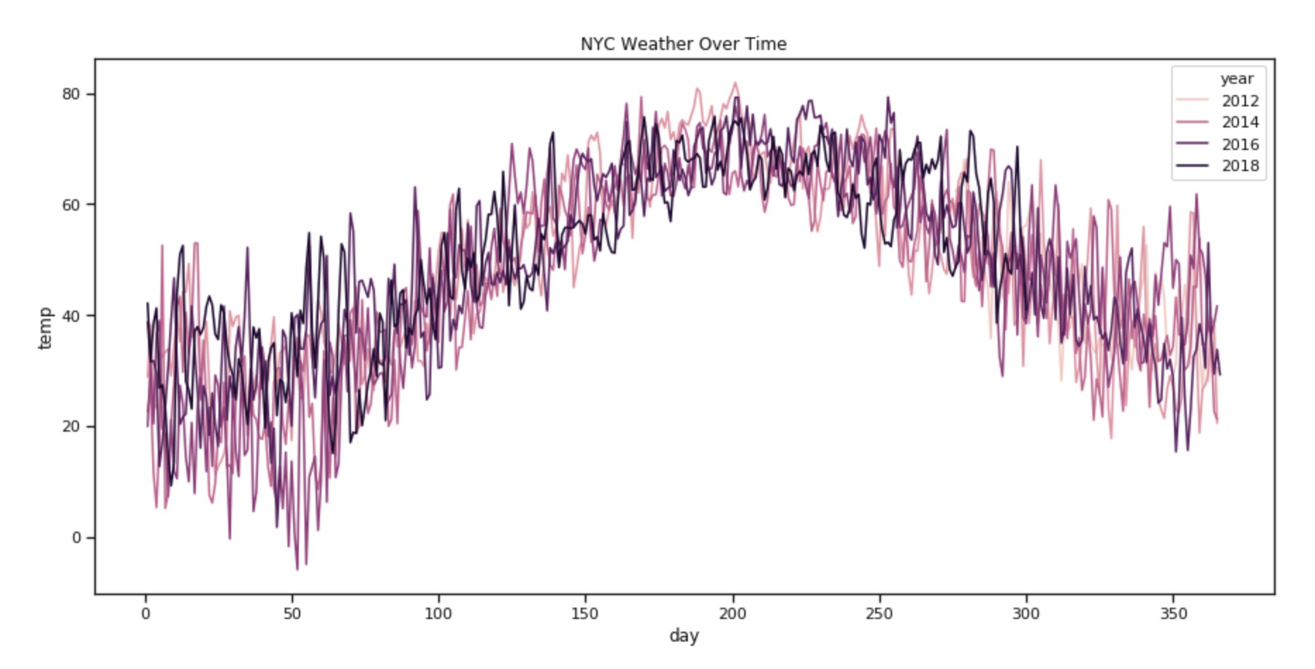
You must be Poseidon 'cuz you're looking like king of the sea right now.
Achievement Unlocked
I commend your patience for sitting through yet another wordy about cleaning data. Unfortunately, 3 years isn't long enough of a time period to visually demonstrate that climate change exists: the world's temperature is projected to rise an average 2-3 degrees Celsius over the span of roughly a couple hundred years, so our chart isn't actually very useful.
Seaborn has plenty more chart types than just simple line plots. Hopefully you're feeling comfortable enough to start poking around the documentation and spread those wings a bit.