I know it's been a while, but you'd be surprised how little time an energy you have when you're building a plane while you're flying it...or perhaps, if you've been reading along with this series, you won't.
Before jumping right into the deep end and showing you some lesser-known (but supremely useful) tricks to save even more time (which you'll no doubt use to implement new tricks to save more time, it's a vicious cycle), allow me to introduce ��the downside of dabbling in the mystic arts:
One of the issues that nearly any overly competent technical analyst will run into eventually is what I'd like to call "the competence loop." This is what happens when your company doesn't understand what you do (because if they did, you literally wouldn't need to exist), but they do understand that you finish your work faster than everyone else, and notice that when they give you more work, it doesn't take you any longer to finish. Now you may be asking how this could be and the answer is simple: you're curious, get frustrated with monotony, and are easily bored. Perhaps you're seeing how this materializes, and if you're a faithful reader, I know this has happened to you:
- You begin to get frustrated with time-consuming spreadsheet tasks (which is what your company thinks you do).
- Your frustration leads you to realize there has to be an easier, faster, and possibly even more accurate way (it's much harder to type something wrong when you're not typing it!)
- Your curiosity leads you to begin researching and eventually implementing a new strategy that does your spreadsheet work for you.
- You enter a holding pattern where you keep developing more efficient ways to accomplish your old tasks, and you've probably shared them with your team.
- Your boss will be mind-boggled with how you're doing this and will offer you more complex work.
- You will accept this work because you're now frequently bored at work with your work, working for you (so that you can drive while you drive).
- In roughly a year, your company will misunderstand what you're good at, and will now change your job to primarily helping others on your team with their work. However, this proves to be difficult, because some people you work with have a different skill-set, and would probably be better at management/training/and supervision than you.
- As it's currently impossible to optimize people (which isn't to say that Silicon Valley isn't trying), you'll stay in this position even if you can move up because, with one more promotion, you won't be working with data anymore.
So, now that we're in the right headspace, let's continue speeding this process, shall we?
When we last left off, you're now capable of solving the vast majority of Excel issues using some combination of IFs, ANDs, ORs, Indexes, and Pivots (and for those situations where you haven't solved the issue, you can always Spackle over it with =iferror(X,"N/A") (which will simply fill a cell with the phrase "N/A" if there's an error...which lets you continue summarizing values in a column, even if some of them are erroneous. This is called "throwing an error"). Now we're going into some cool features you wouldn't know existed until someone told you.
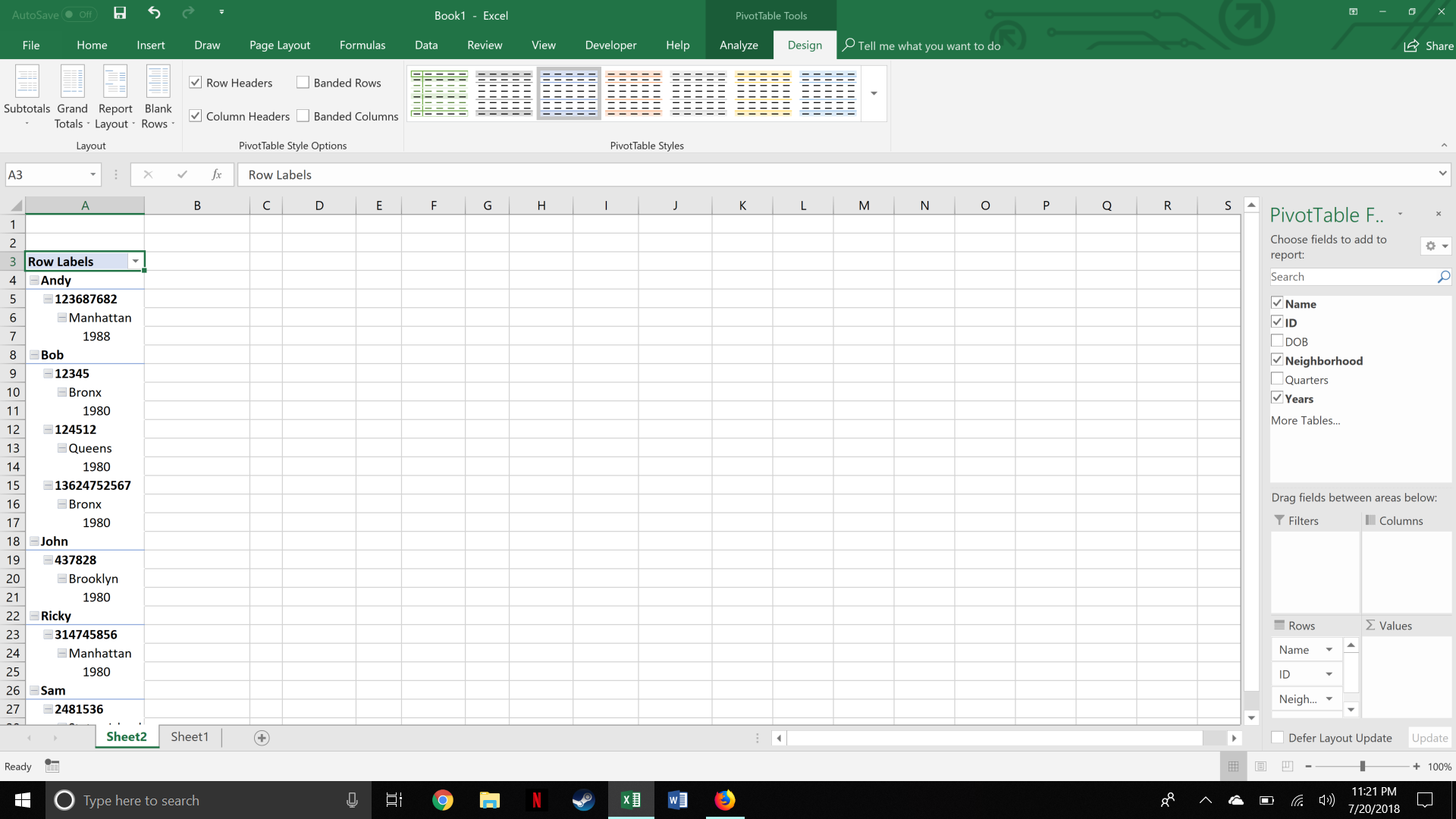
So for the first of these case studies, we'll explore the often neglected "design" tab on the pivot table window, as shown below (hey look, I can embed images now!)

To get here, create a pivot table, then populate the columns with some information. With the pivot table menu still open, you'll realize that the header changes to include two new tabs: Analyze and Design.
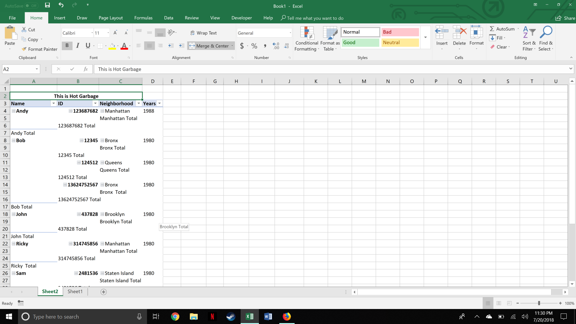
Once choosing design, check out the left-hand side, the real power begins on "report layout". You'll notice that pivot tables generally stack row information on top of each other, which is great for readability, but not much else. As such, if you click the report layout button, and choose "tabular format", it'll rearrange your data so that the values turn into columns... however, it currently looks like hot garbage, as you can see here:

That's where the other design buttons come in.
First, click the subtotals box, then "do not show subtotals" (you can also change where the subtotals are located if you still want em). You can see the results here:

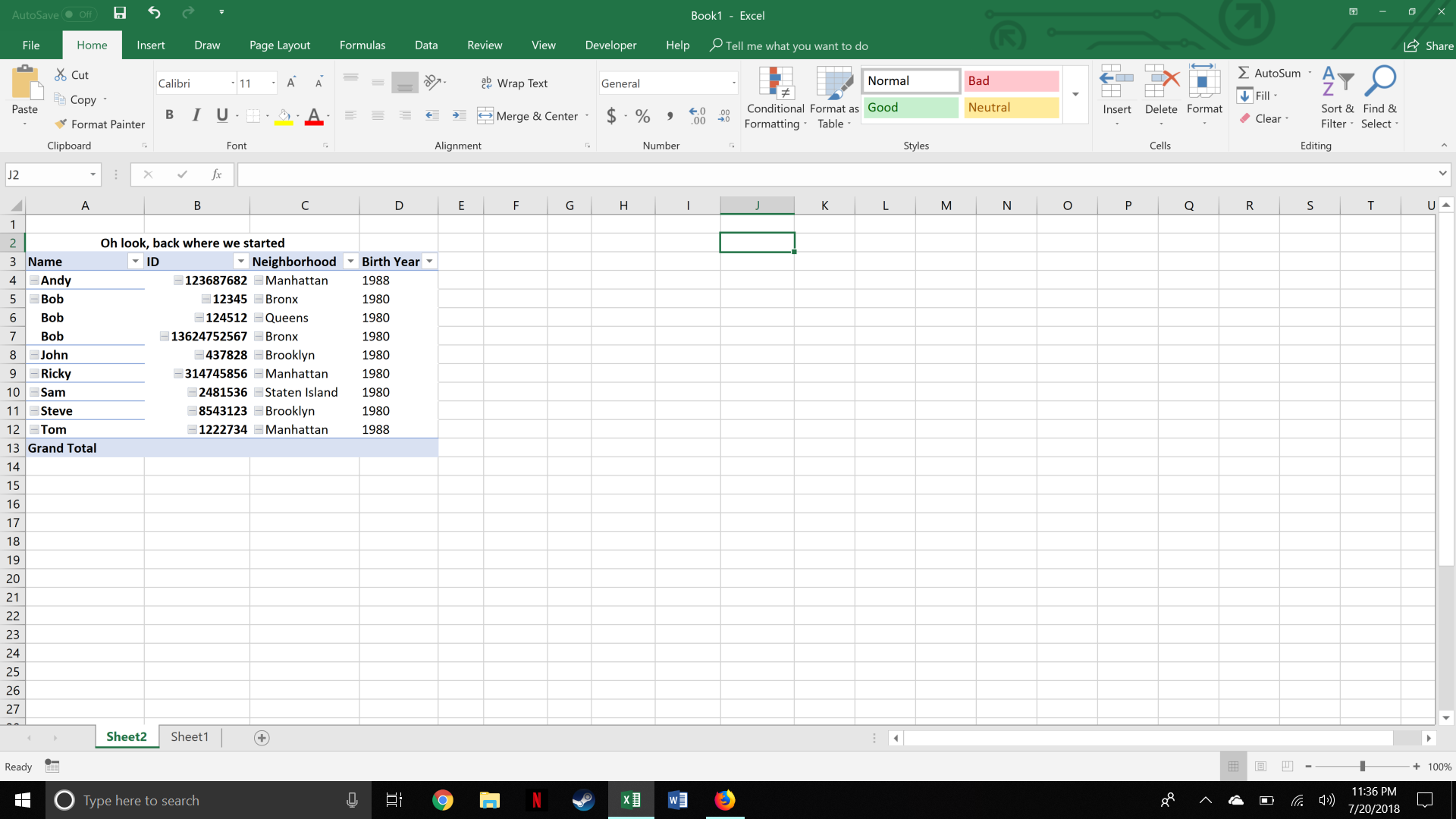
The final step is to click the report layout button yet again, and click "repeat all item labels", this gives you something magical:

Yep, that's right, we essentially created the original data source from the pivot table. While this isn't useful in and of itself (and there's an even easier way to do that), pivot tables can be very quickly reconfigured, and in this format, it allows you to work other excel magic (like index matches and IF statements), and you can get tricky by copying the entire pivot table, and configuring it differently...matching it against itself. As extra icing on the cake, pivot tables are quicker to sort, right click the column you want to sort by and click "sort".
In summary, we learned the following:
- The Engineer's competence feedback loop
- Use the design tab to format a pivot table to make it friendlier for calculations.
- How to sort within a pivot table.
- Some ideas for how you can mess around with this functionality.
Next time, we'll go full McGuyver and use Excel (and Excel alone) to replicate some computer code that if it were programmed in a standard language, would only take 5 seconds to write!


